A graph is a pictorial representation of statistical data clearly. Graphs are often more helpful than list or tables. For this stage, Graphs include:
Pictogram
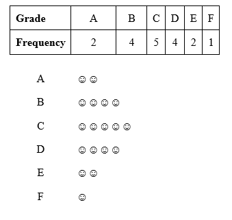
In a pictogram, pictures represent the frequency of data values.
Example:
Study the frequency below and represent the information in a pictogram.

Bar Chart
In a bar chart, the height (or length) of a bar represents the frequency of the data values.
Examples:
Study the frequency below and represent the information in a bar chart.
| Grade | A | B | C | D | E | F | |
| Frequency | 2 | 4 | 5 | 4 | 2 | 1 | |

Pie Chart
In a pie chart, a circle represents all the data, and the sizes of its sectors are proportional to each item.
Examples:
A farmer has 120 animals as shown in the pie chart below:

(a) Using a protractor, measure the angles representing each animal.
(b) Find the number of (i) cows (ii) goats (iii) sheep
Solution:
(a) Cows = 180o
Goats = 120o
Sheep = 60o
(b) Number of cows = 180360×120 = 60 cows
Number of goats = 120360×120 = 40 goats
Number of cows = 60360×120 = 20 sheep
CLASS ACTIVITY
29, 75, 36, 70, 37, 66, 39, 64, 47, 63, 47, 47, 58, 52, 54
| Shoe Size | 6 | 7 | 8 | 9 | 10 | |
| Frequency | 4 | 5 | 9 | 4 | 2 | |
ASSIGNMENT

(a) How many choristers played the violin?
(b) What percentage of the choristers plays the saxophone?
(c) What fraction of the students plays the keyboard?
(d) Which instrument is played by the least number of choristers?
(e) How many are they?
(f) If more instrumentalists are to be trained, what do you think they will be selected to play?
PRACTICE QUESTIONS
9, 5, 6, 7, 7, 6, 3, 4, 7, 6, 4, 4, 8, 2, 3
| Vehicle | Car | Lorry | Bus | Taxi | Other | |
| Frequency | 4 | 9 | 1 | 6 | 4 | |
Read our disclaimer.
AD: Take Free online baptism course: Preachi.com 
Free Science simulations at Classadapt (UK) Classadapt.com