These are diagrams consisting of line showing relationship between corresponding values of two quantities or variable or events.
Advantages of Graphs
- Graphs help to show relationship between two variables
- Graphs make clearer and quicker impression about quantitative information illustrated in tabular form
- They interpret value of variables
- They suggest connection between variables or events
- Graphs make it possible for changes in variables on quantities to be expressed.
TYPES OF STATISTICAL GRAPHS
There are varieties of statistical graphs used in geography. The most common ones among them are as follows:
- SIMPLE BAR GRAPHS
Simple Bar Graphs consist of a number of bars placed side by side. The values in simple bar graphs are represented by a series of vertical bars which run form the plotted point opt the foot. Usually, bars are kept distant form one another or its neighbours. Bar graphs are particularly suitable where date represent values e.g. total annual output of nay commodity or total rainfall in any one mouth which is quite separate and distinct from the proceeding and succeeding ones. Bar graphs are not only concerned with the vertical postures but are often to be seen “turned on their side” with horizontal bars. The following statistics was used to illustrate simple bar graphs of crude oil production in some states in Nigeria in 1982.
Edo State 70,000
Delta State 110,000
River state 50,000
Imo State 20,000
Cross River State 40,000
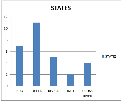
The horizontal system of the simple bar graphs has the following advantages over the vertical system
- It is easy to read
- It is easy to draw
- It is fairly accurate
- The information they represent are easily grasped than the figures they represent
- COMPOUND DIVIDED BAR GRAPHS
These are graphs used to show the magnitude of an item and its constituent parts. In divided bar graphs which are often referred to as Sectional Bar Graphs, instead of the constituent parts of the graph being place side by side or horizontally a sin simple bar graphs, the graphs are placed at eh end of the continuation of each constituent. This can be seen because of the special shading, and the total length of the bar compared with the scale given and the total production.
The following in million of naira was the export of Nigeria to the countries named. Illustrate them using Compound Divided Bar Graphs.
Year Canada USA U.K Total
1980 2.5 60 20 105
1981 2.0 55 30 105
1982 3.0 64 32 136
1983 5 73 27 105
1984 15 62 31 108
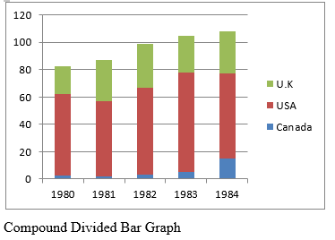
Advantage of Compound Divided Bar Graphs
- They are used to compare statistical data concerned with two different units showing how one is affected by the other
- All the bars rest of the same zero lone making it easy for comparison
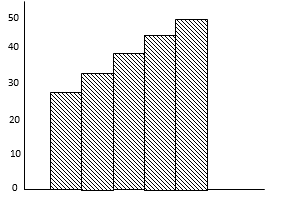
- HISTOGRAM: This is a method that involves the use of bar chart that has on gaps between them. The bar represents the frequencies and their heights and are proportional to information that is indicated.
- MULTIPLE BAR CHART
Multiple Bar Chart used to describe how two or more variable or information vary from one another.
Example
Show the multiple bar char of students’ performance in S.S.S One A, B AND C three consecutive years at A. U. D. Girls’ High School Itire in Geography.
Year Class
A B C
1995 20 25 30
1996 25 30 35
1997 30 35 40
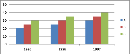
A Multiple Bar Chart
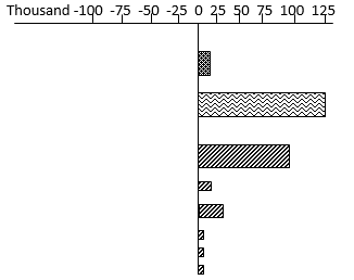
- DIVERGENCE BAR GRAPHS: These are graphs which show changes by way of increase or decrease, compared with a certain standard. The change is measured either form the “horizontal line” where an increase is represented by a bar drawn upwards and a decrease by a bar drawn downwards from a vertical line where an increase is represented by a bar drawn to the right and decrease by a bar drawn to the left.
Below is an illustration to make it clearer. The following tables give numbers of employees in a certain manufacturing industry in two consecutive years. Draw a Divergence Bar Graph to show the changes in the number of employees in each industry over this period.
Year Total Metal Engineering Vehicle Other Textile Food wood others
Manufac- metal & Drinks Paper
Turing goods Leather Tobacco Printing
1st Year 8677 618 2032 912 545 1460 806 888 1416
2nd Year 8794 630 2121 891 558 1461 817 899 1417
SOLUTION IN STEPS
- Subtract the figures for the first year from those of the second year.
- Draw a table and list the figures derived in (I) above in it as shown below. The figures derived are the changes or divergence.
Total Metal Engineering Vehicle Other Textile Food wood others
Manufac- metal & Drinks Paper
Turing goods Leather Tobacco Printing
+ + _ + + + + +
117 12 89 -21 13 1 11 11 1
+ = Positive
- = Negative
- Draw the above information into Divergence bar Graph of employees in a manufacturing firm. (See diagram below)
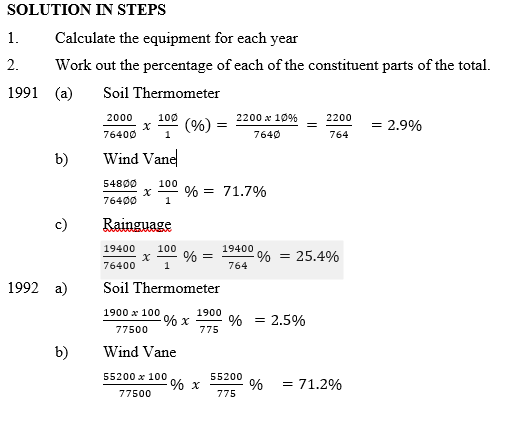
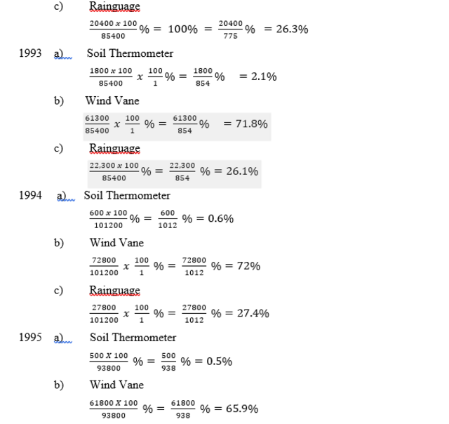
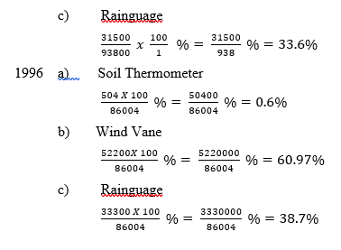
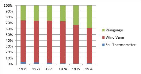
- A PERCENTAGE BAR GRAPH
In Percentage Bar Graph, the bars are divided into proportions to the percentage. In that the constituent parts bear the whole. Since the scale is a percentage scale, all the bars will be of the same length. Thus, the data given below could be grouped using the percentage bar graph by grouped using the percentage bar graph.
The production of Geographical Equipment form 1991 to 1996.
Years soil Thermometer wind Vane Rainguage Total
1991 2,200 54,800 19,400 76,400
1992 1,900 55,200 20,400 77,500
1993 1,800 61,300 22,300 85,400
1994 600 72,800 27,800 101,200
1995 500 61,800 31,500 93,800
1996 504 52,200 33,300 86,004
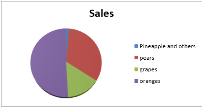
PIE GRAPH OR DIVIDED CIRCLE/CHART
The divided or pie chart as it in usually called is one of the most common statistical diagrams. The total quantity concerned is represented by a circle which is divided into segments or proportions in size to the component.
Perhaps, the most unexpected feature of the pie graph is the considerable amount of simple calculation involved before plotting can take place.
These are:
- The circle must be drawn proportional in area to the total quantity to be represented
- Each component part must be expressed as a decimal or percentage of the whole
- The angle which corresponds with this decimal or percentage of 360musst be calculated.
Example
IMPORTS OF FRUITS BY NIGERIA IN 1986
Oranges 9,428 tonnes
Pears 6,066 tonnes
Grapes 2,768 tonnes
Pineapple and other 244 tonnes
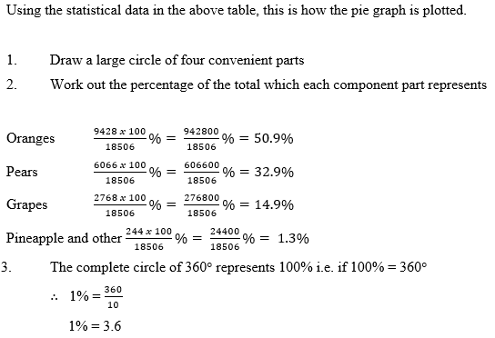
- The complete circle of 360represents 100% i.e. if 100% = 360
1% =
1% = 3.6
Therefore to find the number of degrees or size of the sector corresponding with each percentages, we then multiply each figure of oranges, pears, grapes, pineapples and others, by 3.6. thus;
Oranges = 50.9 x 3.6 = 183.2
Pears = 32.9 x 3.6 = 118.4
Grapes = 14.9. x 3.6 = 53.7
Pineapples and others = 1.3 x 3.6 = 4.7
Divide the circle drawn into sectors and each sector is to be represented by the calculated angles
DOT AND CHLOROPLETH MAPS
This simply refers to the repeated symbols or dots applied to areas and confined to only type of symbol. If the symbol representing the dots indicates so many items, a simple division sum will show the quantity contained within the given areas and the dot representing them must be placed within the area mapped.
This theoretical statements very deceptive, simply because it has introduced several unknown problems. Some of which are:
- How many shall each dot represent, put differently besides the size of the dot?
- How big is the size of the dot?
- Exactly how shall each dot be placed within the area?
- How shall each dot be drawn?
CONSTRUCTING A DOT MAP
There are several steps taken in the construction of a dot map
Step 1
Determine the scale of the map. In doing this, examine the range of quantities indicated in the table of figures.
QUESTION
Based on the statistics given below construct a unit dot map to shows cultivated land area in UTOPIA
COLUMN 1 COLUMN 2
ZONES CULTIVATED LAND (HECTARES)
1 81862
2 160246
3 350504
4 51912
5 140265
6 124440
7 103244
8 44000
SOLUTION
Taking a close look at the range of the figures shown in the above table, the lowest is 44000 hectares and 350504 hectares at the highest. A scale of 1 dot to 20,000 hectares of cultivated land will be suitable. Therefore, proceed to calculate the number of dots that will represent the cultivated lands.
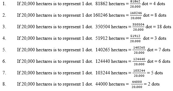
ZONE CULITVATED LANDS (HECTARE) NUMBER OF DOT
1 81862 4
2 160246 8
3 350504 18
4 51912 3
5 140265 7
6 124440 6
7 103244 5
8 44000 2
STEP II
Mark out the dots within the appropriate zone
STEP III
State out the scale of the map. The Utopia Dot Map scale is 1:20,000
CHLOROPLETH MAP
Chloropleth map simply involves the use of indication of quantity or land or density over a given administrative zone. Different symbols are used to distinguish the varying densities over the zones.
THE CONSTRUCTION OF CHLOROPLETH MAPS
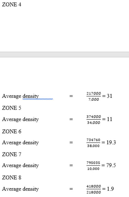
In constructing a chloopleth map, the first step is to calculate the average density for each of the administrative zones. The derive the average density, divide the total population by the land area.
TABLE OF FIGURE
ADMINISTRATIVE ZONE LAND AREA (SQ. KM) TOTAL POPULATION
1 10500 605,000
2 36600 480,000
3 40,000 1,018,000
4 7,000 217,000
5 34,000 374,000
6 38,000 734,000
7 10,000 795035
8 218,000 418,000
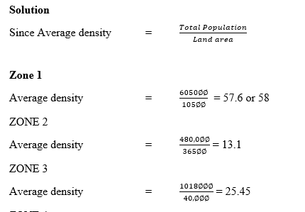
ADMINISTRATIVE ZONE AVERAGE DENSITY
1 58
2 13.1
3 25.45
4 31
5 11
6 19.3
7 79.5
8 1.9
The second step to follow is to determine the scale to be used. In doing this, find out form the question, how many shading it confines you to. Assuming, the question reads thus – using the statistical information above and the outline map provided, and confining the shading to four types.
From the statistical information, Zone 7 has the highest density of 79.5 persons to the square kilometer. Then approximate 79.5 to the nearest round number i.e. 80. To derive the scale therefore, use the number of shading to which you where confined to divide the highest density of 80 i.e. 80 4 = 20. The scale will then read 1 – 20, 21 – 40, 41 – 60, and 61 – 80. Finally, use different types of shading to represent each fo the densities reflected in the scale. The key to each shading must be indicated.
Read our disclaimer.
AD: Take Free online baptism course: Preachi.com 
Free Science simulations at Classadapt (UK) Classadapt.com